Whitepaper
Saito
Layout Design
Illustration
Icon Design
Design Brief
The project's challenge was revitalising the whitepaper design to ensure visual consistency across all icons and graphical elements, harmonising the complex content with the illustrations to facilitate reader comprehension.
1.Whitepaper Design Update
2. Illustrations
3. Social Media Posts
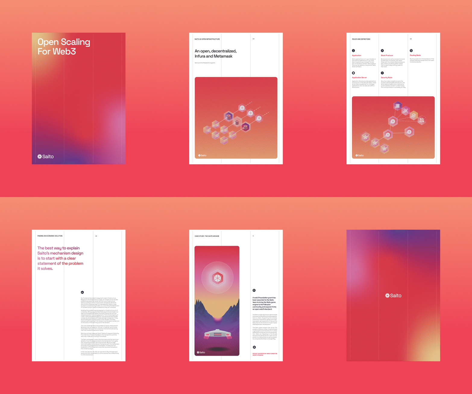
1. Whitepaper Design Update
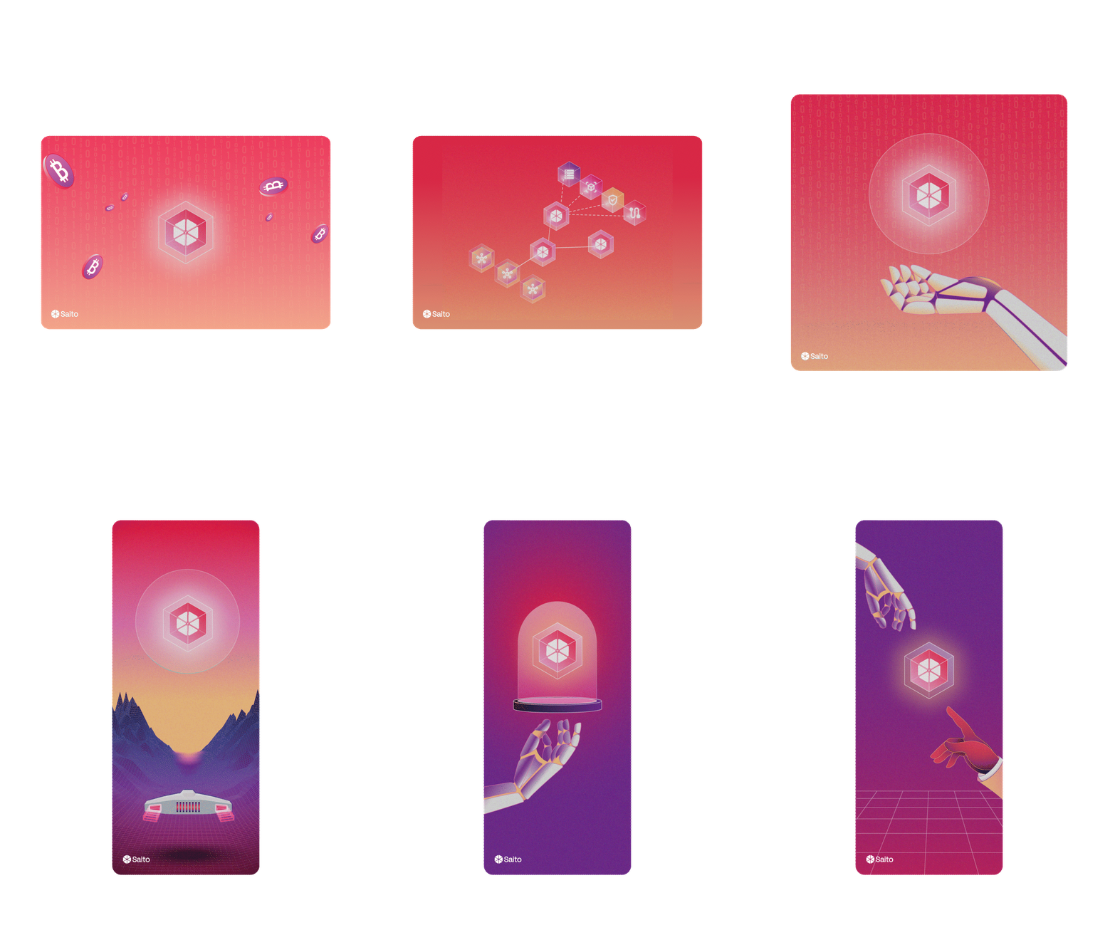
2. Illustrations
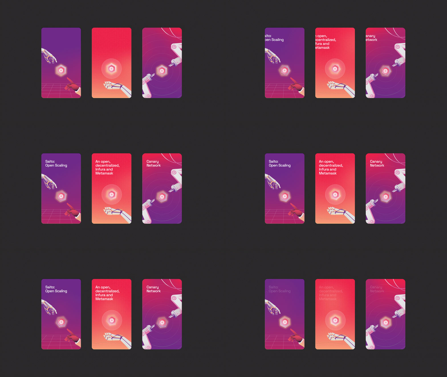
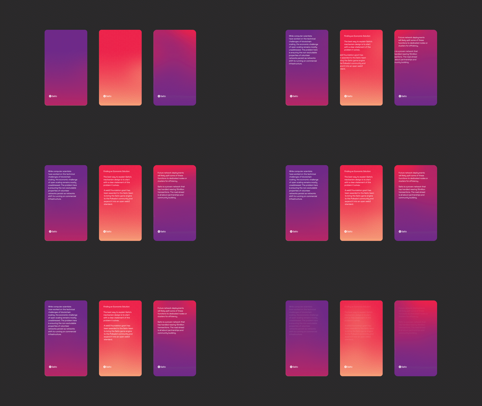
3. Social Media Posts
Execution
To meet this challenge, the icons were meticulously redesigned to create uniformity, enhancing the document's overall visual flow. The revised design maintained a clean and concise layout with a reinforced focus on legibility and a coherent hierarchy, pivotal in guiding the reader through Saito's intricate narrative. A richer colour palette and refined typography were introduced to elevate the aesthetic appeal. At the same time, advanced data visualisations were strategically implemented to depict technical details in an engaging and informative manner. The culmination was a document that resonated with Saito's forward-thinking brand identity and served as a visually cohesive and captivating educational tool.
Reflection
This project underscored the integral role of design in interpreting complex information. By aligning visual elements with the informational structure, we facilitated an intuitive learning experience mirrored the innovation at Saito's core. It was a testament to the power of design in simplifying the complex, proving that when form meets function, clarity emerges. The updated whitepaper stands as a beacon of how design can bridge the gap between intricate blockchain technologies and their diverse audience, establishing a new benchmark for technical document design.